Constructing a visualization dashboard
Citation: J. Colyar, K. Michael, R. Maciejewski and L. Tate, "Constructing a visualization dashboard to improve educational standards in Arizona legislative districts," 2021 IEEE International Symposium on Technology and Society (ISTAS), Waterloo, ON, Canada, 2021, pp. 1-8, doi: 10.1109/ISTAS52410.2021.9629195.
Abstract
The quality of K-12 public education is a perennial issue in Arizona that has heightened in salience over the past several years, with broad public concerns over insufficient funding sparking the Red for Ed movement for higher teacher pay. However, despite the push for educational change, there remain many barriers to K-12 public school education funding, including a lack of visibility for how Arizona public schools are performing at a legislative district level. Such information is released at a school district level by organizations like the Arizona Department of Education, but much of the information is limited and can be difficult for legislators to parse, particularly when school districts lie on the boundary between two legislative districts. Moreover, school outcome data is often limited to raw spreadsheets for the public and may be fragmented between government websites and educational organizations depending on the metric. Ultimately, this hinders the public’s understanding of the current educational standing. As such, a visualization dashboard that clearly identifies schools and their relative performance within each legislative district would be an invaluable tool for legislative bodies and the Arizona public. It is proposed that a dashboard for Arizona at the district level would increase transparency and availability of public information about these districts, allowing legislators to utilize the dashboard as a tool for greater understanding and more effective policymaking. While there are many positive social implications to be afforded by educational dashboards, this article also points to potential risks of this new visibility without end-user training.
SECTION I.
Introduction
Education is one of the most important predictors for success for young children around the world. In the United States, there have been significant movements and progress to advance education as seen with legislation such as the No Child Left Behind Act, and, more recently, the Every Student Succeeds Act (ESSA). As a way to provide the public with information and to create a convenient way to view, interpret, compare and contrast educational data, many states including California and Texas have created dashboards at different levels of government that encapsulate performance, along with environmental factors, such as income. These dashboards allow for public accountability and for individuals to see how well certain schools, districts, or areas are performing. By providing these visualizations to educators, principals, and lawmakers, people with authority and power to make meaningful change in K-12 education are better equipped to do so. Although such dashboards can carry some unintended consequences, such as the possibility of incorrectly correlating performance with action, when the underlying issues may be more systemic, for example, based on differences in demographics, these effects can be minimized by creating better quality dashboards that clearly depict demographics alongside performance metrics.
This dashboard project is a collaboration with the Arizona College Access Network and the Decision Center for Educational Excellence at Arizona State University. While the project itself focuses heavily on educational dashboards, there are also legislative district profiles that are meant to provide cross-sectional handouts for legislators that serve as an alternative method of representing much of the same information. In essence, these profiles encapsulate many of the most important metrics for a given year at a legislative district level. As these products are meant to be hosted and displayed by the Arizona College Access Network, many aesthetic design decisions were made in accordance with their branding guide.
SECTION II.
Literature Review
Dashboards are traditionally defined as “a visual display of the most important information needed to achieve one or more objectives, consolidated and arranged on a single screen so the information can be monitored at a glance” [16]. However, the term dashboard is used to refer to “many different sorts of entities, challenging the dashboard stereotype familiar to the visualization community… The dashboard concept has evolved from single-view reporting screens to include interactive interfaces with multiple views and purposes, including communication, learning, and motivation, in addition to the classic notions of monitoring and decision support” [4]. There are many different types of dashboards, ranging from those more functionally suited to support decision-making such as with real-time data, to those that are more educational and visual like those with existing historical data.
There are quite a few different kinds of dashboards, and many key benefits and reasons to use the dashboard style for presenting information. Dashboards allow individuals or organizations to “visually track, analyze and display key performance indicators (KPI), metrics, and key data points to monitor the health of a business, department or specific process” [5]. In this way, organizations can track certain data either in real time or historically, and be able to draw useful conclusions and correlations. These meaningful connections are also drawn without spending significant time trying to understand the data, as graphs and the dashboard layout ideally provide demographic and contextual information in addition to key tracking metrics. Some of the key advantages of dashboards as outlined are that: (1) they enable “fast and effective decision-making”; (2) they allow for “on-demand, accurate, and relevant information in line with business priorities”; and (3) they allow for “focused identification of problems, inefficiencies or negative trends for immediate action and improved performance” [6].
Although there is significant previous literature concerning dashboards and dashboard design, there is surprisingly scant literature for educational dashboards. The work that does exist for dashboards and education is limited and tends to focus on micromanaging student performance in higher education. For the purposes of an educational dashboard centered around Arizona public data, visualizations are mostly confined to a visual, educational style dashboard that displays recent prior years’ statistics. However, while one of the main focuses is to inform the public and legislators of educational statistics for Arizona, the dashboard also plays a minimal role in supporting decision-making as legislators may be able to identify key problems in their districts and enact change. In this way, a key model could be the California dashboard system with adapted aspects of other accountability education systems [2]; [8] –[9].
While education dashboards and their variety are extremely important to discuss, so too is investigating the potential negative consequences of dashboards. According to McCoy and Rosenbaum, users are very much influenced by sociotechnical networks including political and social contexts when interacting with dashboards, and because of these influences, individuals might interact with the dashboards in ways that were not intended by the designer [10]. For instance, with California’s former system of ranking schools based on performance metrics, legislators, educators, and the public were able to easily identify what is colloquially known as “problem schools”. This can lead to a negative trend in children being transferred by their parents from one school to another, even if they were in attendance at a local zone. This can cause a downward ranking spiral that is irrecoverable without major funding support, injection of teaching resources, and infrastructural upgrades to allow for a more diverse and flourishing community. Consequently, it is vital to consider the unintended consequences of public education dashboards.
Furthermore, it is imperative when creating dashboards to ensure that data and visualizations are treated and clarified as tools for understanding reality rather than concrete truths within themselves. As explained by Crooks: “data team members produced dashboards that presented data as trustworthy and definitive, not because they had necessarily made such a determination, but because the visual organization of information carried those associations” [3]. Consequently, it is worth ensuring that visualizations and data are well understood in terms of their limited display of reality. At least anecdotally, it can be claimed that parents take education portals so seriously, that they make decisions on where the family will reside for the future prospects of their children, based on rankings and reputations. This in turn can push up real estate prices and corresponding services, albeit artificially. There is no doubt there can be shortcomings in the data driven visualizations but the designer must be cognizant of these and overcome them using visual cues or other notices found on the web site.
SECTION III.
Methodology
A. Project Scope
This project is what is probably best described as an action research project where the usability of the dashboard is researched alongside its creation to fulfill this niche. This project is not affiliated with a study and was conducted in close collaboration with the Arizona College Access Network (AzCAN). A program of College Success Arizona, AzCAN is a community of college access professionals committed to closing the education attainment gap in Arizona. Their primary goal is to increase the percent of high school graduates enrolled in a postsecondary education right after graduating high school to 70% by 2030. The educational dashboard’s primary purpose is to help increase the college enrollment rate across Arizona for high school graduates. The Network offered to host and present the dashboard and associated materials along their specific organizational requirements. For example, they requested that the dashboard be made available alongside static legislative district profiles. These profiles would reflect similar information to the dashboard and serve as potential handouts to legislators during an annual luncheon meeting with Arizona legislators. In addition, while most of the design decisions were left open, the organization did specify that they would prefer if the legislative profiles and dashboard could reflect their brand coloring. Furthermore, given that AzCAN would be hosting the product deliverables on their infrastructure, the products themselves would need to be easy to modify and adapt for future years.
B. Design Framework
Given these requirements, it was important to select an appropriate dashboard design model that would best fit the scope and shape of this project. To accommodate the iterative design process and changing requirements from the client, the ninestage design study methodology framework [12] was chosen as the best candidate to model the basic outline. The basis for choosing this model was that this design process focused significantly on varying levels of both internal and external validation rather than placing the main focus on software architecture validation. Moreover, because the design and upkeep of the dashboard needed to be relatively simplistic and straightforward, it was decided that it should be built in Tableau, which the client was very familiar with and the pdf profiles were built-in to their Piktochart environment with visible branding.
Therefore, since the software design of the dashboard was limited to the Tableau platform, it did not make sense to choose a design framework that placed significant emphasis on coding and software architecture.
1) Precondition Phase: Personal Validation
For the limited time and scope of this project, not all of the nine steps in the framework [12] carried equal weight. The first three steps, learn, winnow, and cast, focus on the process of dashboard research, identifying positive and negative characteristics of the dashboard, and identifying and understanding the individual stakeholders involved in the project. The learn and winnow steps were given extra emphasis as it was important to investigate the state of dashboard development and existing dashboards as applied to education governance both in the United States and internationally [1], [79]. The final step, cast, which emphasizes understanding the roles of individuals, management, and organizations involved in the process, was given little weight given the main deliverable was an education dashboard created through a self-motivated and voluntary effort by Arizona State University. The other stakeholders, i.e., main client and associated organizations involved, acted as facilitators as opposed to direct contributors or managers.
2) Core Phase: Inward-facing Validation
The next major category of the methodological framework is core and contains discover, design, implement, and deploy. Discovery, which placed emphasis on requirement analysis, was seriously considered as it was very important for the project to meet the expectations of the client and to ensure that the product would be functional, maintainable, and modifiable for future improvements and data. Moreover, the design phase, where most of the major design choices were made, also carried significant weight as it was very important to ensure a high level of usability for the dashboard, while also maintaining a layout that could be easily understood. The implement phase encouraged iterative and simple prototypes, while the deployment phase focused on deploying the product and utilizing a form of validation and usability testing which in this case consisted largely of survey feedback. Both of these phases were also given significant consideration.
3) Analysis Phase: Outward-facing Validation
The last phase, analysis, consists of the reflect and write phase. While a phase that focuses on reflecting and writing about the contribution of work through the creation of this dashboard is very important, the analysis stage was ultimately given less weight. An overview of the dashboard concept for this project was presented by Justin Colyar at the 2020 IEEE International Symposium on Technology and Society dedicated to the theme of Public Interest Technology [15], as well as through formal write up phases in the form of software documentation.
C. Data and Cleaning
As part of the requirement for an analysis and research process, various sources of educational data needed to be compiled and cleaned to understand what certain requirements and designs were reasonable and achievable within the given timeframe of the project. Data was taken from several different public sources including the Arizona Department of Education, and ACT testing data. Additional private enrollment and district information was taken from the Arizona College Access Network and the Decision Center for Educational Excellence at Arizona State University. This data included U.S. Department of Education FAFSA (Free Application for Federal Student Aid) rates, the Arizona Department of Educational high school enrollment rates, Arizona College Access Network’s list of schools enrolled in educational programs, the ACT Menu of Assessment data, and Decision Center for Educational Excellence files on demographic information and school college readiness data (see Table 1).
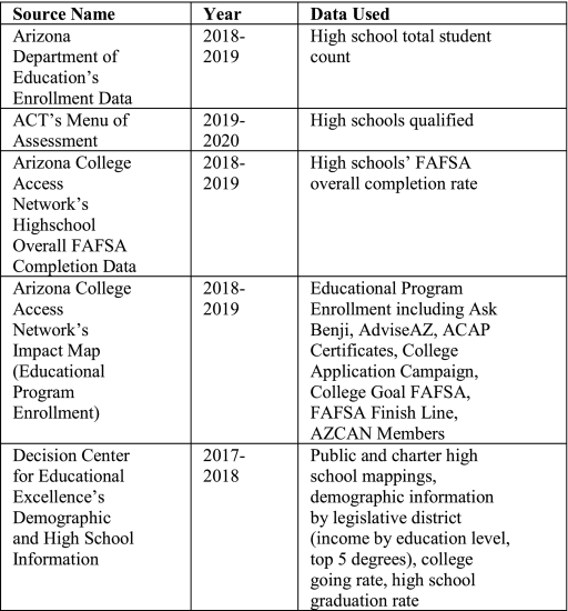
Table 1 : Sources of Data Used To Develop the Dashboard
While all of these files contained the necessary information, many times data reporting was difficult to aggregate. Often this is because schools and their names change over time and not all of the sources reflect a school’s current name, nor was the vintage of each data file the same. Moreover, some of these files would only include the school’s name and not their local educational agency ID, negating a primary key on which to conduct clean database “joins.” Consequently, some of the spreadsheets needed to be manually edited to include correct ID’s for schools that could not otherwise be properly mapped.
D. Unit of Analysis
Each of the individual data files from their respective sources were at different levels of abstraction. The ACT, school enrollment, FAFSA, and educational program enrollment data were at the individual school level. On the other hand, the demographic and college readiness data were already abstracted to the level of legislative districts. Another file containing information on public and charter schools including which district a school belonged to was provided by the Decision Center for Education Excellence. Therefore, while this data existed for individual schools, in order to abstract the data to create a legislative district overview these schools needed to be mapped to their respective geographic administrative districts. To achieve this end, a simple Postgres database was used which allowed for SQL queries of average district information. It is important to note that the data included in these aggregate numbers is for public and charter schools only as there was no geo-mapping information for private schools.
E. Legislative District Profiles
The legislative district profiles that were developed are handouts that encapsulated much of the same information as the dashboards and could be physically given to legislators at a luncheon. In this way, the legislative profiles were created to try to mirror some of the more important information while following the design choices made by AzCAN. Such information included the demographic breakdown of income and education levels of resident of the district, while also focusing on major indicators of educational success such as high school graduation rates, college-enrollment rates, degree attainment rates, and FAFSA completion rates. A list of schools enrolled in select educational programs was also included, such as, Ask Benji, an interactive AI chat-bot for FAFSA questions.
SECTION IV.
High-Level Design
A. Stakeholders and Use-Cases
In this project, there were several use cases considered in the development of the AzCAN educational dashboard design. The first was a user who needed to access the educational dashboard in order to learn more about the educational standards and initiatives being undertaken by schools in their own district of residence. For example, this user could be a parent, it could be a senior student at a high school about to graduate, or a newly graduated high school student, among others (e.g. NGOs placing pressure on legislators to act to lift standards of education in under-resourced districts). In this case, the user should be able to easily find and select the district they live in and then visually be able to infer an approximate educational level of district residents based on certain indicators of educational success. Another use case to consider is for a user (e.g. a legislator) who might want to be able to compare the educational level of one district with another or to the state average in order to identify strengths and weaknesses of a given district using aggregated outcomes data for graduates of the district’s schools.
There are two different target audiences: Arizona legislators and the general public. For Arizona legislators, interactions with the dashboard should be more about gaining information for continuous improvement within a legislator’s district, and to encourage further investigation into ways to raise educational standards via legislation or direct encouragement of enrollment in different statewide initiatives. For the general public, the dashboard and legislative profiles will be more of an informative tool to hold the legislators accountable and, in future iterations of the dashboard, to view changes over time of how education has been affected and supported.
B. Dashboard Design
1) The Integral Role of a GIS Front-End
To address these key use cases, the dashboard was designed to visually allow users to easily and conveniently obtain information. The first major design decision was to create an interactive heat map of Arizona using the different key indicators of success. In Tableau, this would mean creating a map object and importing shapefiles for the legislative district boundaries from an existing ArcGIS map with objects. The user would be able to utilize the address search features of the map in order to identify their own legislative district of inquiry. This is the power of a geographic information system (GIS), in essence, allowing the conduct of a geographic-based query with such ease. Certain selectable attributes chosen by the user such as college-enrollment rates can then be overlaid onto the map to create an easily interpreted and visually pleasing heat map. The advantages of seeing data displayed in a map and providing the user the ability to zoom in and zoom out is well documented. The interactive map would allow the user to select any legislative district with a corresponding view of the specific values for that boundary object. This heat map allows for quick general comparisons between all of the different districts and partially addresses the aforementioned use cases.
2) Auxiliary Data Interpretation via Graphs and Statistics
For more fine-grained control of the dashboard, a user can select which two regions they would like to compare, including a comparison with the state average. In this case, displaying the comparison on a fixed axis bar graph was chosen as one of the best ways to visually represent the differing levels of any two regions. With this tool the user can focus on a specific comparison, such as the overall average, which would not be possible on the heat map alone. This provides an additional level of scrutiny for the user, as yet another level of interpretation is made available, that could be considered complimentary to the primary detail shown. Furthermore, to address more schoolspecific data about enrollment in different educational programs, the user can select which educational program they are interested in and see an outputted list of schools in the primary region polygon selected. This list is an effective and fast way to identify schools in different programs. Given more time and specific location information, a better way might be to identify these schools and emphasize visually on the map interactive points representing all of the schools that are enrolled in a user-selected educational program.
To make the dashboard more interconnected and interactive, the user can select a legislative district on the map to update which district’s schools for the educational programs are being viewed, as well as update the bar graph’s primary region polygon comparison. In this way, the user is able to easily identify their own or neighboring districts, and more easily create meaningful comparisons. When the user is prompted to select the district, they are also able to modify it by changing the parameter selected in the dropdown list from the Controls panel. To help guide the user through navigating the dashboard, a brief description of each control dropdown list is described on the farright panel. A screenshot of this control section along with the heat map, bar graph, and list of schools display can be seen in Figure 1, demonstrating the power of the educational dashboard.
C. Legislative District Profile Design
The legislative district profiles are meant to mirror the same information that is conveyed in the dashboard but in a static format that could theoretically be distributed via handouts to Arizona legislators. In addition, the design of the legislative profiles needed to closely match the branding guide of the client.
The top section of the legislative district profiles contains a few crucial pieces of information. First, a banner at the very top of the profile, identifying the district for which information is being provided, alongside an illustration of a graduating student. Since the main encompassing feature of these profiles is supposed to be the college readiness, the college-attendance rate, degree attainment rate, high school graduation rate, and FAFSA completion rate were also included at the beginning of the document. In particular, the college-going rate was the primary metric and was included as a bar chart compared against the state average next to a similar bar chart that depicts degree attainment against the state average. These two indicators were considered the most important indicators of student success and college readiness for a district. Immediately following these bar charts are two individual pie charts showing the high school graduation rate of the district with the state average, as well as the FAFSA completion rate and the state average. The top section of this legislative profile document handout can be seen in Figure 2. The need for this physical hand-out points to the importance of printer-friendly dashboards with download capability of cross-sections of information of interest. The vast majority of educational dashboards do not offer this capability.
The middle portion of the legislative profile contains the statewide initiatives that various schools are enrolled in, for example, FAFSA Finish Line. Each school is listed as a bullet point below each separate educational program along with the associated logo of each organization. In order to convey some of the demographic information for each district, the top five degrees for individuals living in the district were included (see Figure 3). The last part of the legislative profile includes median household income by education level as shown above in Figure 4 to highlight both the importance of education on district residents’ income as those with a bachelors make significantly more, but also to give a general impression of the district’s affluence which is shown to be correlated with student achievement.
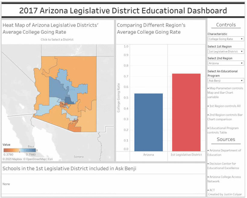
Figure 1: A screenshot of the final legislative district educational dashboard, including a heat map of Arizona, bar graph, and list of schools.
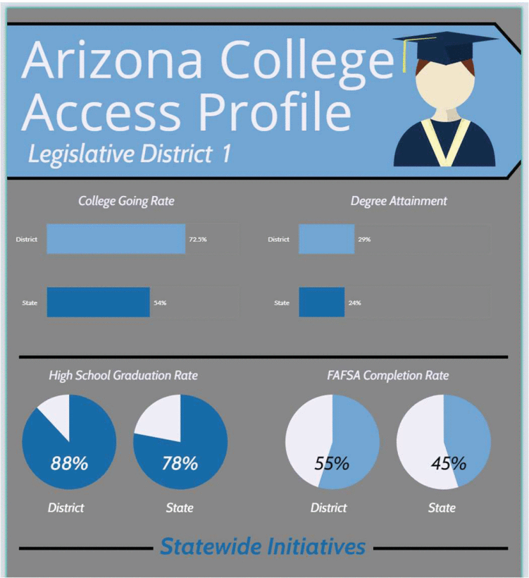
Figure 2: A screenshot of the top half of the 1st legislative district profile that shows the comparison of the district’s and state’s college-going rate, degree attainment rate, high school graduation rate, and FAFSA completion rate.
The top section of the legislative district profiles contains a few crucial pieces of information. First, a banner at the very top of the profile, identifying the district for which information is being provided, alongside an illustration of a graduating student. Since the main encompassing feature of these profiles is supposed to be the college readiness, the college-attendance rate, degree attainment rate, high school graduation rate, and FAFSA completion rate were also included at the beginning of the document. In particular, the college-going rate was the primary metric and was included as a bar chart compared against the state average next to a similar bar chart that depicts degree attainment against the state average. These two indicators were considered the most important indicators of student success and college readiness for a district. Immediately following these bar charts are two individual pie charts showing the high school graduation rate of the district with the state average, as well as the FAFSA completion rate and the state average. The top section of this legislative profile document handout can be seen in Figure 2. The need for this physical hand-out points to the importance of printer-friendly dashboards with download capability of cross-sections of information of interest. The vast majority of educational dashboards do not offer this capability.
The middle portion of the legislative profile contains the statewide initiatives that various schools are enrolled in, for example, FAFSA Finish Line. Each school is listed as a bullet point below each separate educational program along with the associated logo of each organization. In order to convey some of the demographic information for each district, the top five degrees for individuals living in the district were included (see Figure 3). The last part of the legislative profile includes median household income by education level as shown above in Figure 4 to highlight both the importance of education on district residents’ income as those with a bachelors make significantly more, but also to give a general impression of the district’s affluence which is shown to be correlated with student achievement.
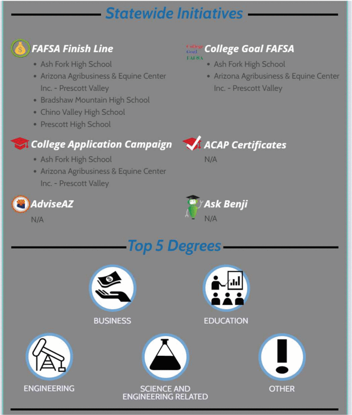
Figure 3: A screenshot of the middle portion of the 1st legislative district profile depicting schools in the districts enrolled in various educational programs as well as demographic information about the top five degrees of all individuals (parents and graduates) living in the district. Initiatives with N/A have no schools in that program.
SECTION D.
Design Limitations
There were several limitations during the project’s lifetime. Although the dashboard does provide a meaningful and useful product upfront, it should be considered for its potential in not only the type of data that is available to end-users but also with respect to usability and design. In fact, this is very much in line with the ethos of the methodological framework as defined by Sedlmair, Meyer, and Munzner [12]. Also, while the dashboard and legislative district profiles provide meaningful data visualization and were tested for usability, the sample size and user demographic were limited. In future iterations of this work, the design methodology and dashboard usability would need to be empirically tested further. However, this is not to say that the Validation phase was ignored altogether. On the contrary, Section 5 provides a summary of the survey instrument that was administered to stakeholders and feedback results received to improve the initial design of the product.
SECTION V.
Validation
To properly validate the design, there were three important stages that were deemed necessary during the testing process [11]. Those three stages were: colorblind testing, usability survey polling, and client feedback. With these different stages, it was important to plan and design the testing process to ensure a successful validation phase. In addition, there was also a check to ensure that the validation process was consistent with the chosen dashboard design methodological framework [12].
A. Colorblind Testing
Since this dashboard and legislative profile are being released to the general public, it is important that the color scheme and heat map chosen for the dashboard be an appropriate pallet for individuals without any sort of colorblindness, as well being functional for those with some form of colorblindness. To this end, the heat map was chosen to have a color scale from red to blue. This not only emphasized the slight differences between the districts for many attributes but also remained appealing and neutral for many forms of colorblindness. To further ensure that colorblind users would be able to operate the dashboard without difficulty, the software Color Oracle was utilized. This software simulates various colorblindness by alternating the color scheme shown. With this, the dashboard was tested to be friendly for protanopia, deuteranopia, and tritanopia colorblindness through simulation as outlined by Jenny and Kelso [14].
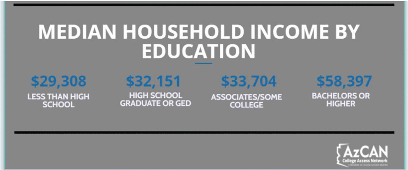
Figure 4: A screenshot of the bottom portion of the 1st legislative district profile depicting the median household income by education level.
B. Usability Survey Polling
To test the usability and related aspects of the dashboard, a survey was created and distributed to individuals at Arizona State University. Note that school district level participants were not included due to the limited timeframe of this project. The survey was designed with the principles outlined by Do and Finkenbinder in mind, incorporating close-ended, mutually exclusive, specific, and neutral terms [13]. The survey contained five questions and included the following categories: clarity, ease of navigation, interpretability, aesthetic, and other. Clarity here is related to how clear the overall dashboard is while ease of navigation is about the intuitive control and flow of the dashboard. Interpretability here is how well the user is able to easily draw conclusions from the data and aesthetics is focused on the visually pleasing nature of the dashboard. For the “other” category, the question was simply an open-ended text-based additional feedback question. Given the design of a dashboard varies between that for a computer dashboard versus a mobile device, an additional question was included to distinguish between the two, ensuring accurate feedback.
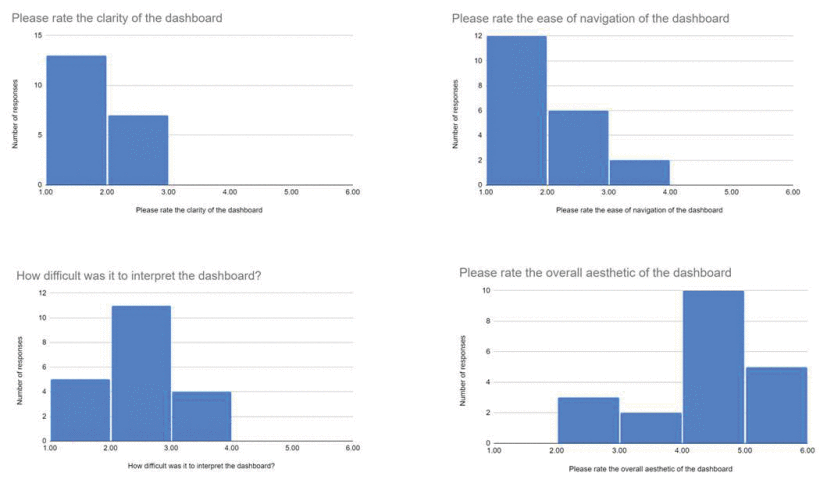
Figure 5: Validation Survey Results (clarity, ease of navigation, interpretability and aesthetics)
The sample size for the survey was small at only 20 people, split almost equally between mobile (45%) and desktop (55%) users. The results for each of the major categories for usability were on average fairly high with clarity receiving 1.35 with 1 being the ideal score, ease of navigation receiving 1.5 with 1 being the ideal score, interpretability receiving 1.95 with 1 being the ideal score, and aesthetics receiving a 3.85 with 5 being the ideal score (see figure 5). Although the interpretability and aesthetics of the dashboard were somewhat lower than desired for the developer of the dashboard, many of the low-ranking scores provided insightful usability comments that were taken into consideration and implemented into the final version of the dashboard.
C. Open-Ended Qualitative User Feedback
While quantitative data can provide excellent indicators for a variety of usability design factors in software development, open-ended qualitative user feedback can yield vital insights for developers. The additional open-ended feedback question received 9 responses. In terms of aesthetics P1 wrote: “it was difficult to see the whole screen/scroll around when I was in split-screen and the page was only half the total size.” P8 said the “page was easy to navigate” but it was “a little tough to review the map colors in black and white if it were to be printed out” but that it did not affect the intended goal of the project so was likely less important to consider. P5 recommended that information would be clearer “if [they] could tell the change in values by the change in relative sizes of the bar when [they] flipped through the districts, but since the scale of the graph change[d] the size of the bar stay[ed] the same making it seem as if two districts ha[d] the same value.” P7 also noted similarly, when they wrote: “I think it would be better if the graph scale was the same throughout all of the districts for more clarity.” P9 provided some suggestions for the Controls panel of the dashboard noting it was “a little cramped from a usability standpoint.”
On the general criteria of user friendliness, P2 was frank in their assessment that the “the entire site was not that intuitive and required trial and error”. This was in contrast to P4 who noted: “[the site was] organized and professional”. P7 also wrote: “it’s pretty easy to figure out that it’s mainly a comparison between districts and the state average”. Although P3 was looking for greater clarity, noting: “I feel like “CollegeGoing Rate” [should have] a more professional term.” P6 wanted the same as P3, better definition of things that would be helpful for interpretation. P3 noted the concept of “regions,” adding “I didn’t know what some of the things [i.e. items] were (I guess it depends on your audience though?)” and that it might be helpful to the end-user to have a description. P8 also said that possibly “a short summary of options available at the top [of the dashboard] would be helpful, as it took them a minute to realize they could reanalyze the map by income, instead of the default college-going rate. P5 for consistency sake also said it “would be good to have the y-axis of the bar graph fixed to 1.”
In terms of functionality P8 noted there was “much information available after taking a few minutes to look through [the dashboard].” The same user noted their ability: “to select two districts, determining them by ‘income without high school degree’, pick districts on opposite ends of the spectrum, and then compare the two by ‘high school graduation rate’ and draw [their] own conclusions, with ease due to the layout of the page.” However, one user [P2] noted a problem with the mapping feature: “any other map would let you click and drag, but this map requires the user to fumble around, find, and enable click and drag manually.” This was in contrast with P8 who said: the “map search function was easy to make use of, and the comparison chart for two areas was helpful and intuitive.” In contradiction, P2 reported finding an error after some browsing of the web site. They wrote: “found a bug where if I select something and then accidentally click exclude, the whole map disappears until I refresh the page”. This error was addressed, as were all the areas of improvement cited above. The overall comments from participants included: “overall great site though” [P2], “overall nice job” [P3], “looks good” [P4], “[t]his is very clean” [P1], “the dashboard was clean, and pleasing aesthetically. Honestly very well done” [P9], and “dashboard was very clear and concise” [P8].
D. Ongoing Feedback from Primary Project Client
Another level of validation has been ensuring that the design, coloring, and layout of the dashboard and profiles met the project requirements as outlined by the client. These products were closely developed with the client through ongoing direct communications. Frequent meetings were held with the client to acquire feedback that was then implemented into design sketches or into the product depending on the phase. Although the design methodological framework [12] does not specify an exact usability or testing process, it does imply that the design and testing process should be iterative. Despite the short process for testing due to time restraints, comments and feedback received about potential improvements that could be made to the dashboard sparked re-analysis of other educational dashboards for similar features and adaptation as was necessary. Consequently, the usability and design of the dashboard were able to be tested for colorblindness, usability, client feedback, and the iterative design process.
SECTION VI.
Social Implications, Risks and Consequences
The creation and publication of the dashboard along with the legislative district profiles could spur unintended consequences and, while those are minimized in the design process, it is still important to consider any potential lasting consequences. The most systematic way to address this is by considering the implications of each visualization and related data that is being published. The heat map and bar graph on the dashboard is linked to several metric variables, namely the collegeenrollment rate, the high school graduation rate, the percent degree attainment for high school graduates, the students’ ACT Menu of Assessment rate, the FAFSA completion rate, and the median income levels of varying educational degrees in a district. Since these characteristics are abstracted to the legislative district level, for parents already living in one of the legislative districts, far from the district boundaries, such information would most likely have little effect on their decision as to where their child attends school. This is because there are many large legislative districts, and since the map and bar graph are abstracted to the district level, parents would be unable to tell the quality of the school by using the dashboard. The higher the density of the population, the smaller the legislative districts and greater visibility of school performance in the district are.
For those parents that are living in a metropolitan area like downtown Phoenix where there are numerous adjoining district boundaries, it is possible that parents might consider changing schools based on the data found on the dashboard, as there are several districts in the metropolitan area significantly outperforming others. Fortunately, this dashboard does very little to enable this kind of decision-making, as there is no information about these metrics visibly displayed at the school level. Instead, parents would be more likely to be prompted to change schools from ranking sites like www.greatschools.org. These kinds of web sites may be used by individuals to suggest the quality of education. Therefore, while there is a slight risk of student migration, given the factors, abstraction, and other websites that already fill such a niche, it would be highly unlikely that this dashboard sparks any major student migration.
On the other hand, for legislators in Arizona, seeing these data values abstracted and used as a metric for accountability could potentially lead to legislators and educators artificially increasing these numbers by attempting to game the system rather than provide meaningful change. Although somewhat unlikely, depending on the level of accountability and importance given to such a dashboard, there is a chance that numbers may artificially increase as part of an attempt to improve apparent educational standards. While this risk should not necessarily be dismissed, even in the process of gamifying some statistics such as the FAFSA completion rate, the general effort to marginally increase these statistics could actually help some individuals as more students filling out the FASFA still would raise college readiness for those students. Furthermore, it is also likely that given this accountability, legislators and educators will be able to work more closely to address some of these issues and determine underlying structural faults.
When considering the effects of the list of schools in each district enrolled in different educational programs, there is again the risk of parents transferring their children to different schools. This is somewhat more likely than the bar graph and heat map as individual schools are listed and, thus, if a parent happens to be deciding between two physically proximate schools and sees that one has significantly more programs available for their child, they may decide to select one school and not the other. However, given the lack of other school-level statistics from the dashboard, it appears unlikely that a parent would use that single measure as the deciding factor when other more convenient web sites exist for the purpose of comparing schools.
For legislators, one potential effect of the school enrollment program is that they may misinterpret the schools enrolled in these programs as the schools that are the top performers of the district. However, it could be the case that many of the schools enrolled in these programs are enrolled as a means of catching up or competing with the other more affluent and successful schools. In this way, those schools enrolled in these programs may not get the necessary assistance required. Although not impossible, it seems unlikely that a legislator would use this as a factor for school support when private dashboards exist that provide better predictive factors for student success.
Many of these unintended consequences can be mitigated through education and training beyond the design process that can accompany the dashboard. For instance, if the legislators and parents were given a brief walkthrough or disclaimer before interacting with the dashboards, they would be much less likely to make rash decisions based solely on the information provided.
SECTION VII.
Conclusion
The key findings over the duration of this project were that 1) the dashboard methodological framework provided by Sedlmair, Meyer, and Munzner [12] worked well for the scope of this project and; 2) the stunning lack of literature regarding the intersection of usability, dashboard design, and education governance warrants further contributions and research on state education dashboards. The live prototype dashboard and legislative district profiles documented in this paper make a significant contribution to the scant body of literature on government education dashboards, as no specific design studies were identified during the search. These products are to be released on AzCAN’s website and additional development of this project is uncertain. Furthermore, from a practitioner’s standpoint, a mission aspect was the lack of a consolidated point of education data and consistency across files, typical of data sets from a variety of sources and vintage. Moreover, these dashboard findings are relevant for educational dashboard creators, as well as more generally, individuals searching for more general dashboard design validation.
ACKNOWLEDGMENT
The author team would like to thank Terri Bookman for her editorial assistance.
References
1. SAS Output. [Online]. Available: www.texasschoolaccountabilitydashboard.org/state.html. Accessed: Apr. 6, 2021.
2. California School Dashboard (California Department of Education). [Online]. Available: www.caschooldashboard.org/reports/37683380000000/2019. Accessed: Apr. 6, 2021.
3. Crooks, R. (2017). "Representationalism at work: Dashboards and data analytics in urban education." Educational Media International, 54(4), 289–303.
4. Sarikaya, A., Correll, M., Bartram, L., Tory, M., & Fisher, D. (2019). "What do we talk about when we talk about dashboards?" IEEE Transactions on Visualization and Computer Graphics, 25(1), 682–692. https://doi.org/10.1109/TVCG.2018.2864903
5. "Data Dashboards: Definition, Design Ideas, Plus 3 Examples." Klipfolio. [Online]. Available: www.klipfolio.com/resources/articles/what-is-data-dashboard. Accessed: Apr. 6, 2021.
6. "What Are Dashboards and Dashboarding?" Logi Analytics, Jan. 3, 2019. [Online]. Available: www.logianalytics.com/resources/bi-encyclopedia/dashboards-dashboarding/. Accessed: Apr. 7, 2021.
7. Denwattana, N., & Saengsai, A. (2016). "A framework of Thailand higher education dashboard system." In 2016 International Computer Science and Engineering Conference (ICSEC) (pp. 1–6).
8. Hough, H., & Kirst, M. W. (2017). "California's dashboard data will guide improvement." Education Next, 17(1). Available: www.educationnext.org/californias-dashboard-data-will-guide-improvement-forum-hough-kirst-accountability/. Accessed: Apr. 7, 2021.
9. Humphrey, D. C., & O'Day, J. (2019). The Early Implementation of California's System of Support: Counties, Differentiated Assistance, and the New School Dashboard. ERIC Clearinghouse.
10. McCoy, C., & Rosenbaum, H. (2019). "Uncovering unintended and shadow practices of users of decision support system dashboards in higher education institutions." Journal of the Association for Information Science and Technology, 70(4), 370–384. https://doi.org/10.1002/asi.24131
11. Munzner, T. (2009). "A nested model for visualization design and validation." IEEE Transactions on Visualization and Computer Graphics, 15(6), 921–928. https://doi.org/10.1109/TVCG.2009.111
12. Sedlmair, M., Meyer, M., & Munzner, T. (2012). "Design study methodology: Reflections from the trenches and the stacks." IEEE Transactions on Visualization and Computer Graphics, 18(12), 2431–2440. https://doi.org/10.1109/TVCG.2012.213
13. Do, H. H., & Finkenbinder, K. (2013). A Reference Guide for Interpreting Statistics and Creating Survey Questions. Carlisle, PA: Peacekeeping and Stability Operations Institute, U.S. Army War College.
14. Jenny, B., & Kelso, N. V. (2007). "Color design for the color vision impaired." Cartographic Perspectives, 58, 61–67. https://doi.org/10.14714/CP58.270
15. Colyar, J. (2020). "Constructing a visualization dashboard to improve educational standards in Arizona legislative districts" (presentation abstract). In K. Michael & R. Abbas (Eds.), 2020 International Symposium on Technology and Society (ISTAS): Public Interest Technology, Phoenix, AZ. ISBN 978-981-18-0529-5.
16. Few, S. (2017). "There's Nothing Mere About Semantics." Perceptual Edge (blog). Available: www.perceptualedge.com/blog/?p=2793
Authors
The Honors College School of Computing and Augmented Intelligence, Arizona State University, Tempe, Arizona
School for the Future of Innovation in Society, Arizona State University, Tempe, Arizona
School of Computing and Augmented Intelligence, Arizona State University, Tempe, Arizona
Office of AppliedInnovation and School for the Future of Innovation in Society, Arizona State University, Tempe, Arizona
Citation: J. C. Barrett, K. Michael, R. Maciejewski and L. Tate, "Constructing a visualization dashboard to improve educational standards in Arizona legislative districts," 2021 IEEE International Symposium on Technology and Society (ISTAS), Waterloo, ON, Canada, 2021, pp. 1-8, doi: 10.1109/ISTAS52410.2021.9629195.